Is your brand suffering from bounce rates? Let us make that right!
Hi there! For once, let us face it: landing pages are difficult, are they not? After spending hours adjusting designs, coming up with catchy headlines, and perfecting your calls to action, you may be wondering why conversions are still below your ideal level.
In actuality, even minor errors on your landing page can drive visitors away more quickly than you can say “bounce rate.” But do not worry, I will take care of you! This blog post highlights several typical landing page errors—believe me, we all have done them—and how to address them to make your page more conversion-friendly. Are you prepared to begin? Come on!
Why Should You Bother Fixing Your Landing Page Mistakes?
The digital handshake between you and your audience is represented by landing pages. However, they can undermine your marketing efforts if they do not work. Here’s why it should be a high priority to correct landing page errors:
Missed Opportunities for Conversions and Data Collection
Every visitor that leaves is a missed opportunity to acquire a lead or important audience data.
High Bounce Rates and Poor Brand Perception
Visitors will abandon your landing page if it does not feel right, taking their potential business and trust with them.
Wasted Ad Spend and Low Search Engine Ranking
If your landing page is not optimized, you are wasting money on ineffective advertisements and losing out on natural traffic.
10 Landing Page Mistakes to Avoid at All Costs
Landing Page Mistake#1: All Ads Go to One Landing Page
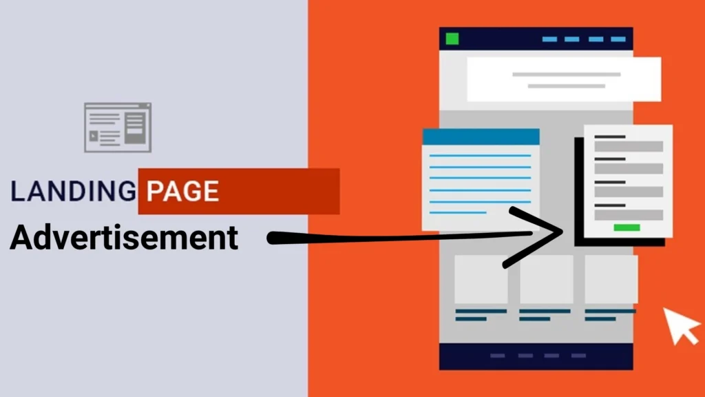
Alright, visualize this: Some of your advertisements are promoting a new product, while others are about a summer sale. But you know what? They are all being directed to the same landing page. What a huge error! The reason is that different advertisements appeal to different demographics with various demands. It is like trying to sell ice cream to someone who wants steak if you direct everyone to the same generic page.
How to Proceed?
Make distinct landing pages for every advertisement. It all comes down to targeting. Align the landing page with the product or target audience of the advertisement. Make sure that when someone clicks on a summer sale advertisement, they are taken to a page that highlights the savings rather than a generic “buy now” page.
Landing Page Mistake#2: Using Average Images to Get the Best Results
Consider that the images on a landing page are, well, simple. You are neither impressed or excited by them. Perhaps they are generic stock photographs or are blurry. To be honest, how many times have you left a website because the pictures did not adequately represent the brand? I am certain that I have!
What to do?

Make an investment in pertinent, high-quality photos. Do not be content with “good enough.” Make use of imagery that embodies your brand, evokes a response in your audience, and is directly related to your offer. Given that people are visual beings, an image that evokes strong feelings in them can have a significant impact. When you view an amazing photo on a landing page, do you have any “wow” moments? Yes, strive for that.
Landing Page Mistake#3: Flexing a Complex Layout
You want your landing page to be unique, and I understand that. The problem is that if your layout is very intricate, people will simply become confused. Imagine entering a store where everything is messy and unorganized. You would most likely leave, would not you? Websites are no different.
What to do?
Keep things simple and tidy. Believe me, it is not a negative thing to embrace white space. Your offer, the CTA (Call to Action), and perhaps a few supporting features should be the visitor’s main focus. Make an effort to organize the website properly so that users can navigate the content without being overwhelmed. An orderly arrangement is similar to a welcome mat at your door.
Landing Page Mistake#4:Multiple CTAs = More Leads
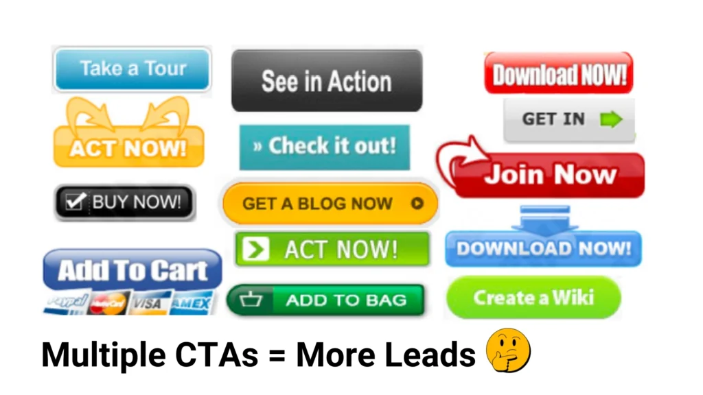
Isn’t it alluring? You believe that by including several calls to action (CTAs), such as “Download Now,” “Learn More,” and “Buy Today,” you are providing users with choices, but in reality, you are only creating confusion. It is overwhelming in the same way as when you go to a restaurant with a 10-page menu!
How to proceed?
Select a single, obvious action. Would you like them to subscribe to your newsletter? Have you downloaded anything? Buy something? Whatever it is, make sure your primary call to action is prominent and not hidden among several other buttons. Be straightforward, simple, and focused. Success is simple.
Landing Page Mistake#5: Following a Robotic Tone
I would probably become disinterested and quit your page if the tone was official, dry, and somewhat robotic. Talking to a friend who is reading from a script is similar to that. Nobody enjoys that!
What action should you take?
Address your audience as if they were your friends. Make use of a warm, approachable, and relatable conversational tone. Talking like a human is more important than using jargon or being formal. It increases credibility and humanizes your brand. Consider it more like a coffee conversation than a lecture with your prospective client.
Landing Page Mistake#6:A Dedicated Social Proof Section is Enough
Do you know how you immediately look at the reviews when you are shopping online? Even while that social evidence is quite potent, it will not have the same effect if it is buried at the bottom of the page or contained in a single section.
Steps to take
Incorporate social proof into your landing page. Client logos, case studies, reviews, and testimonials should all be displayed next to your call to action. People are more likely to act themselves if they perceive good comments because they trust other people.
Landing Page Mistake#7: Ignoring Page Loading Speed
Let us discuss patience—or the absence of it. Everyone knows how annoying it is when a page takes a very long time to load. After waiting and clicking on something, you determine it is not worth it. That is precisely the result of a delayed landing page.
Steps to take:
Ensure that your page loads quickly. Reduce unnecessary scripts, compress those images, and test and improve your website with Google’s PageSpeed Insights. A page that loads quickly keeps users interested, and guess what? Fast pages are also preferred by Google, so your SEO will improve.
Landing Page Mistake#8: External Links all over the Page
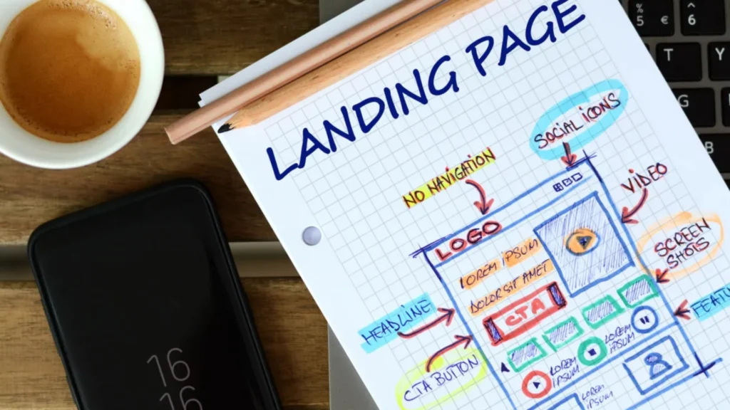
You can not wait to show visitors all these resources, but guess what? You are only distracting from your primary objective, which is conversions if your page is overflowing with links that take visitors to other locations.
How to proceed?
Keep your landing page’s external links to a minimum. To prevent visitors from leaving your page completely, if you must include them, make sure they open in a new tab. Keep the CTA and your offer front and center. You do not want your visitors to leave your page and forget what you have to offer.
Landing Page Mistake#9: Optimized only for Desktop
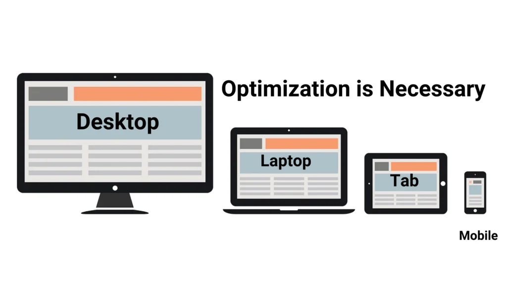
Now that you have confirmed that your landing page looks fantastic on a desktop, have you checked how it appears on a mobile device? Given the current volume of traffic originating from smartphones, it is imperative to optimize for mobile.
Steps to take:
Ensure that your landing page is mobile-friendly and displays well on smartphones. This implies that your CTA buttons, text, and images should all resize to accommodate smaller screens without becoming cluttered. To make sure your page works perfectly everywhere, test it across a variety of devices.
Landing Page Mistake#10:Weak Copy
The truth is, it makes no difference how attractive your page appears if your copy fails to address the wants or problems of your audience. They will be gone in an instant. People will leave your landing page if it seems like a sales pitch or, worse like it was created by a robot.
What to do?
Pay more attention to advantages than features. Discuss how your service or product makes life easier or solves a problem. Make use of compelling, interesting wording that emotionally engages your visitor. Imagine it like a gripping narrative that motivates people to move forward.
Are You Making Any of These Landing Page Mistakes?
Do not fear, you are not the only one who has made any of these mistakes. However, you now have a plan to address them. You can make a landing page that feels inviting, encourages conversions, and assists you in achieving your goals by concentrating on optimizing these areas. Believe me, even minor adjustments can have a big impact!
“Your Landing Page Can Do Better—Let’s Make It Happen!”
Final Thoughts!
Your landing page is the first thing people see about your company and can require their interest and encourage them to take action. It is like the front door to your business. However, even the most successful companies make the same mistakes that drive away potential customers.
The good news? Correcting these errors is not difficult. Conversions can be greatly increased by making minor adjustments like streamlining your layout, speed optimization, and using a welcoming tone of voice.
Consider your landing page an ongoing project rather than a one-time use. The secret to turning it into a high-performing asset for your company is to test, analyze, and optimize it regularly.
Examine your landing page more closely. Do you have any of these errors? If so, it is time to make the necessary repairs and see the magic happen!


